The next Guideline that we will be exploring in our WCAG 2.2. series is that of Practicability and how it assists the user journey on your site.
Presenting information across your site in a way that your users can anticipate, allows for ease of use and is considered good design.
It also makes a crucial difference for people with disabilities, who may become disoriented when information or controls are in different places on different pages.
Issues include difficulty completing a form or finding a page that provides information required for them to complete a task.
Without the necessary help, some users may abandon the task or swap to a competitor!
According to W3.org, the intent of this success criterion is to help users with disabilities by presenting content in a predictable order from web page to web page, and by making the behaviour of functional and interactive components predictable.
In this post, we are focussing on the two new criteria to Guideline 3.2: Preticable, namely:
Let’s jump in, shall we?
3.2.6 Findable Help (A)
The intent of WCAG standard 3.2.6 is to ensure that users can easily find help for completing tasks when they are on a website. It applies to single-page applications (SPAs) and any set of web pages with blocks of content that are repeated on multiple web pages.
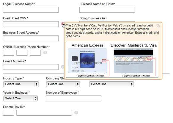
It is distinctly different from interface-level help, such as contextual help (tooltips), which gives answers to your users’ questions directly without requiring them to browse your entire help section.
See illustration below
 Example of a tooltip with an image (Source: ProProfs)
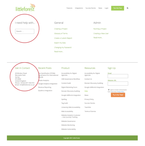
This success criterion ensures that a human contact mechanism is displayed in the same place on all of your site pages and that at least one of the following mechanisms always be included:
- Human contact details, e.g. a phone number, email address and hours of operation.
- Human contact mechanisms, e.g. a messaging system, chat client, contact form, social media channel.
- Self-help options, e.g. up-to-date FAQs, How Do I page, Support page.
- An automated contact mechanism like a chatbot.
Here are a few notable points to remember regarding these mechanisms:
- The human contact details should help the user connect with the part of the business that will assist with (or solve) their problem and not be a catchall contact point for the entire organisation.
See the Illustration below:

- If a self-help option is provided and human support is not available, the self-help option must state that.
- If a chatbot option is provided, it should meet other WCAG success criteria. At the very least, chatbots should be able to:
- recognise misspelt words,
- provide human contact details if the chatbot is unable to provide a satisfactory response after three attempts, and
- be dismissed with a single interaction, and recalled using a link or button.
3.2.7 Hidden Controls (AA)
The intent of WCAG standard 3.2.7 is to help people with cognitive disabilities easily find the controls needed to either progress to the next step of a task or complete a process.
The criterion states that controls should be visible without user interaction as those users with cognitive impairments may have difficulty finding controls if they are selectively hidden as part of the screen design.
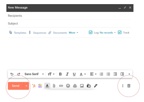
Ways to pass this criterion should include providing persistently visible (i.e. always visible) controls. For example, when writing an email, the buttons needed to send or delete the email are visible at all times without having to hover around the editor.
Like so:

In multistep processes (or multipart forms), the control may be hidden. But, as soon as the user needs to move forward, the button must be persistently visible without having interacted with the control.
It should also be noted that the success criterion doesn’t require inactive controls to be visible all the time. For example, when a form requires fields to be completed before the submit button becomes active, the submit button does not need to be visible.
Conclusion
By implementing the latest Predictability criterion, your users will have an easier, enjoyable and more successful journey on your website. You will also be well on your way to achieving Accessibility success! Be sure not to miss our next post, where we focus on the new criterion for Guideline 3.3: Input Assistance.
At Little Forest, we support your business with automated accessibility monitoring, helping you improve the web experience for your users whilst avoiding costly lawsuits and fines. We work with you to understand the compliance of your site and use the reports to help you put together an accessibility strategy.
The Little Forest platform gives you instant reports on how your pages perform against all major standards. We are continuously upgrading our systems to be in line with the latest legal requirements helping you stay in line with the latest guidelines.
Is your business compliant with the latest Web Accessibility guidelines? Get in touch and speak to the Little Forest team today!


